SUN-MAID
FEATURED CASE
BRAND REFRESH / PACKAGING REFRESH

/ OVERVIEW
Grow young
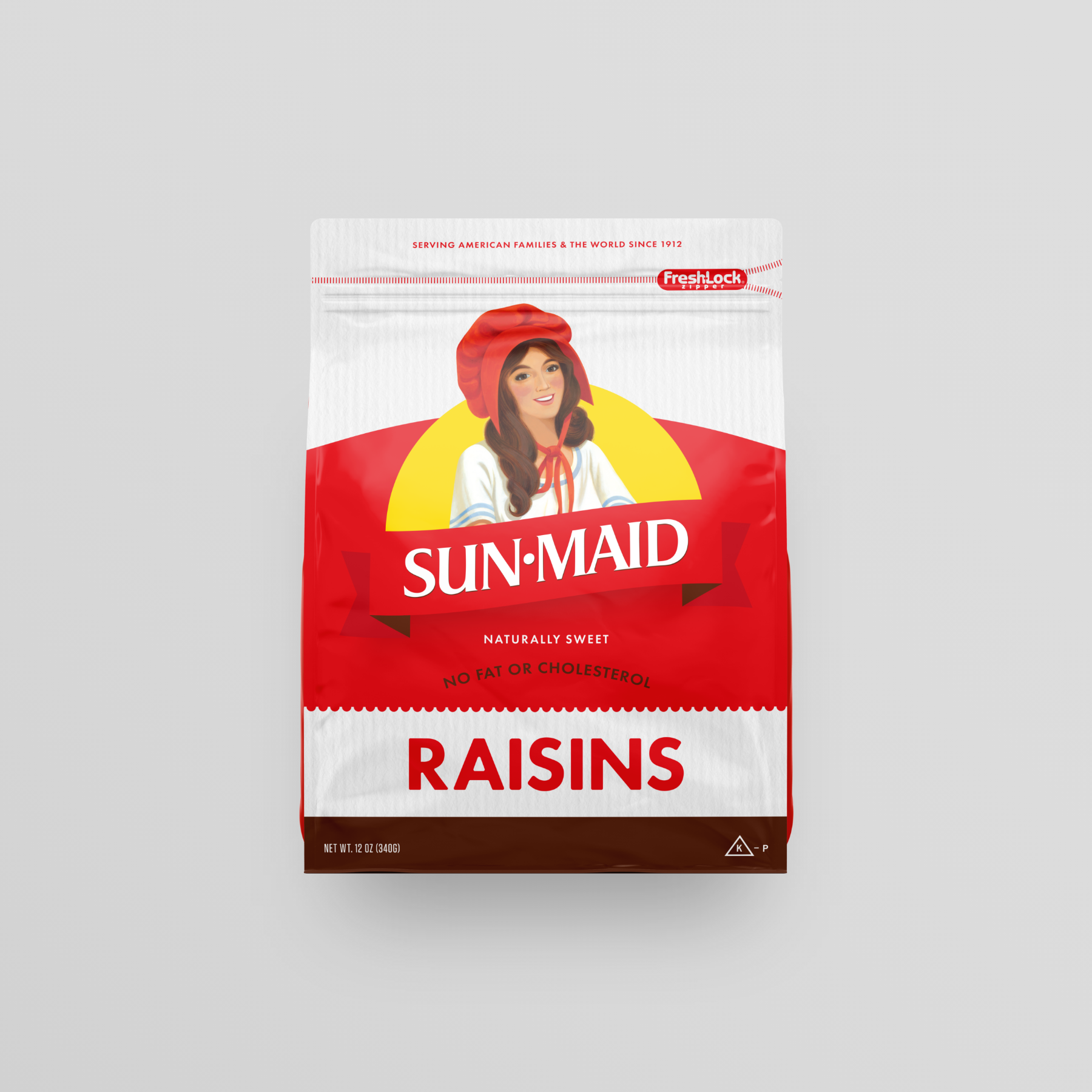
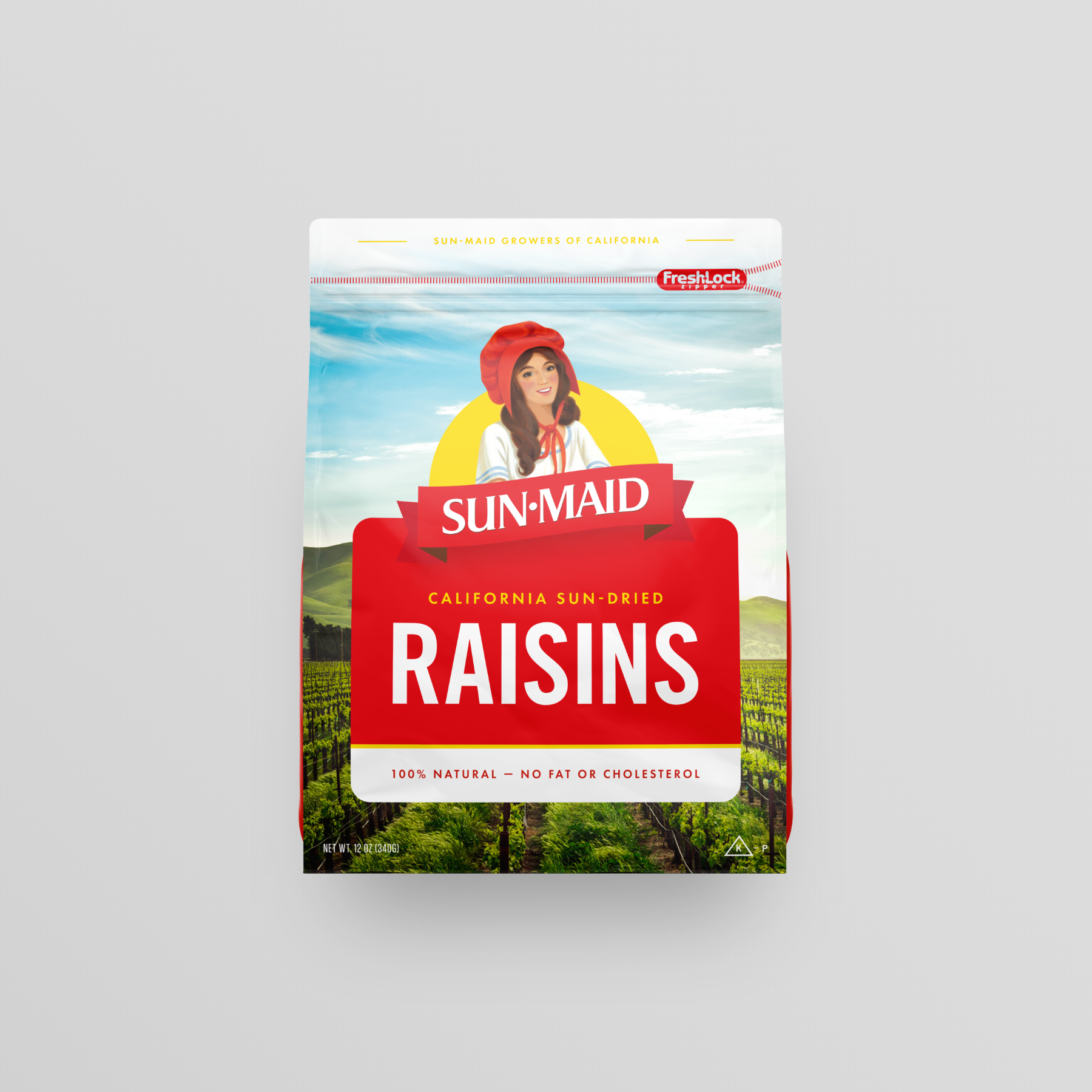
Sun-Maid Raisins, a beloved brand with a rich history dating back to 1912, has decided to embark on a transformative journey by refreshing its brand and packaging for the first time since 1970. The project's overarching goal is to modernize Sun-Maid's visual identity while preserving the brand's heritage and core values.
Sun-Maid holds a special place in the hearts of consumers as a symbol of wholesome goodness and timeless quality. The decision to refresh the brand comes from a strategic desire to connect with a new generation of consumers while maintaining its loyal customer base. With the slogan "Grow Young," the brand aims to convey the idea that indulging in Sun-Maid Raisins is not just about enjoying a healthy snack but also about embracing a youthful and vibrant lifestyle.
AGENCY / COLLABORATION
quench Agency (AOR)
James Madsen (CD)
Keith Seaman (ACD)
Joe Barry (Designer)
Sam Renner (Sr. Copywriter)
ROLE
Art direction, design
BRAND REFRESH
/ 01

This project was featured on the Dieline, Brand New, and published in Graphis Design Annual Packaging — 10.
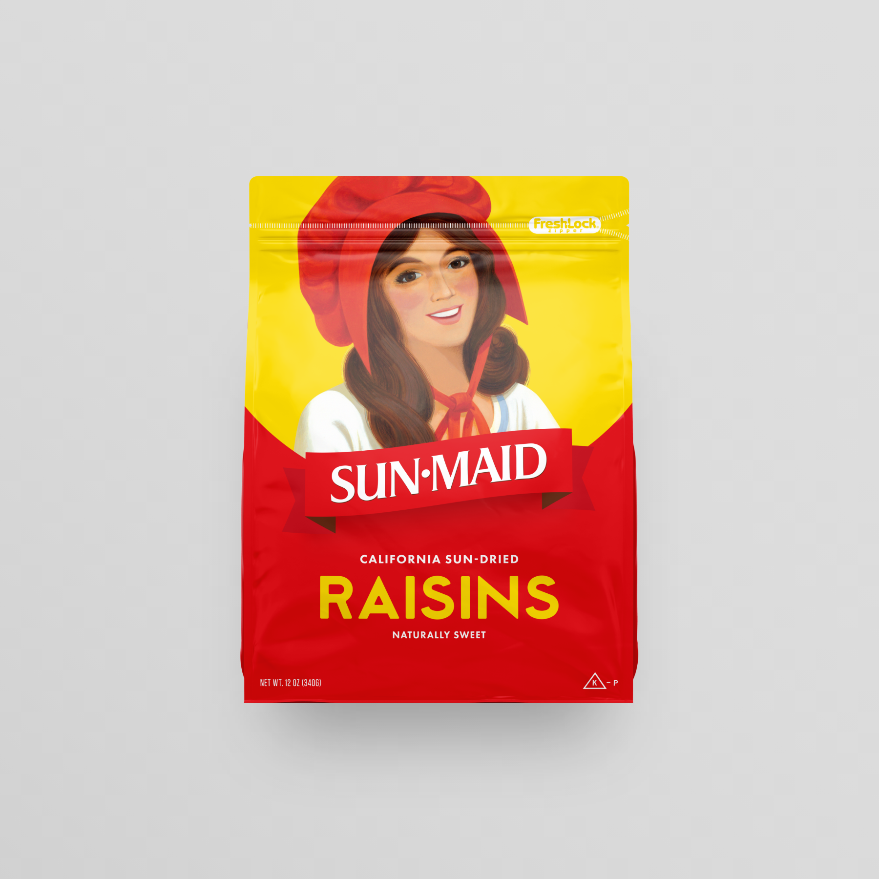
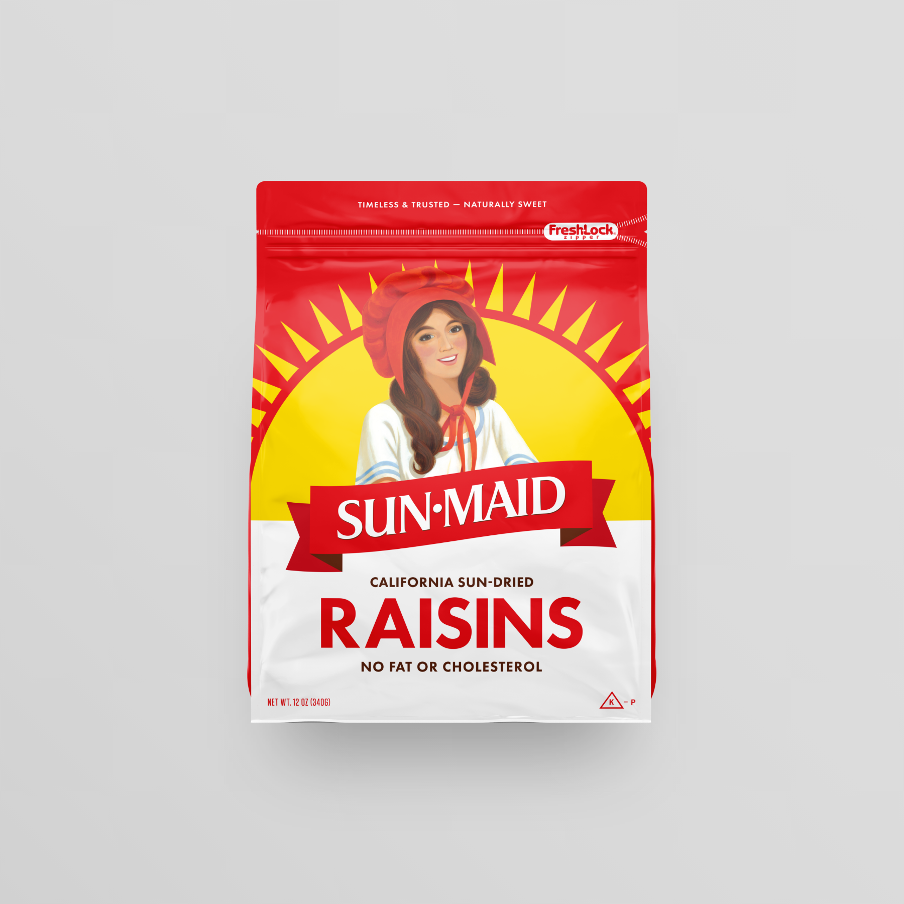
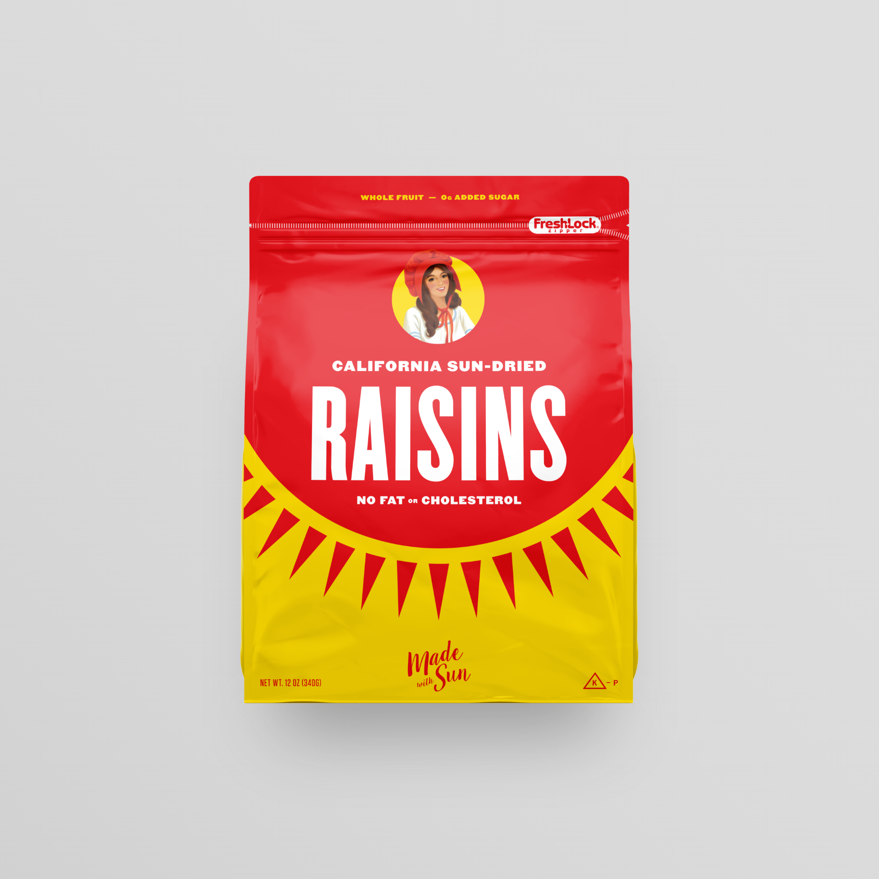
In 2020, Sun-Maid shifted its consumer-focused efforts toward millennial shoppers. With that came a number of global changes that included new research, strategy, and consumer-facing packaging.
Assignment
Update the brand look and feel to resonate better with millennials while not alienating long-time consumers.
“Our main goal was to preserve the iconic look and feel of the brand,” explained Harry Overly, President & CEO of Sun-Maid. “We wanted to find a good balance between our past and where we’re going to reach the modern millennial shopper.”
— Harry Overly, President & CEO of Sun-Maid
Research & Testing
Numerous focus groups were held to gather data about the brand and its consumer base.
"Through testing, we learned that consumers were wary about changing the packaging, they had a strong emotive connection to it. One consumer told us in research groups that messing with the red box was like 'taking the stars off the American flag.' Therefore, we had to make a decision to make the design an evolution versus a revolution. Forthcoming new products also needed to play nice within the design system, so [the new branding] had to accommodate that requirement, as well."
— Keith Seaman, Creative Director
Creative
At first glance, it may not seem like much but we experimented with a large number of treatments for the sun, typefaces, and overall lockups.
"We started by looking back with more than 100 years of designs, Sun-Maid had plenty to reference. We then moved forward by adding modern design hints."
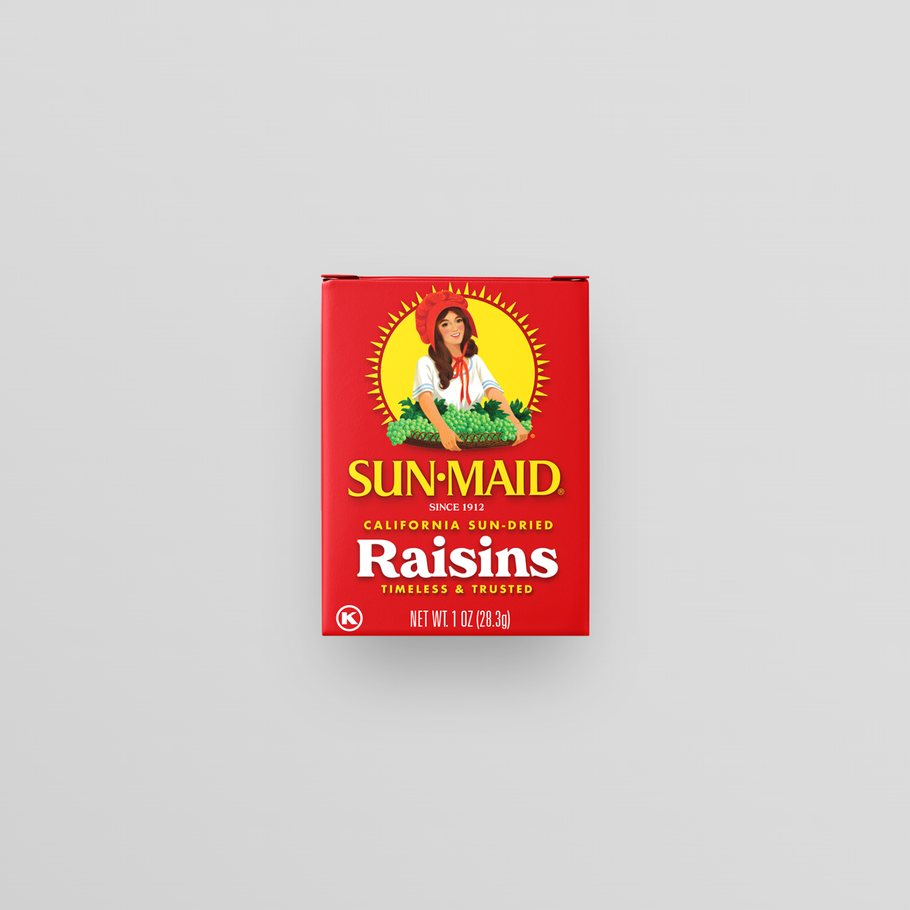
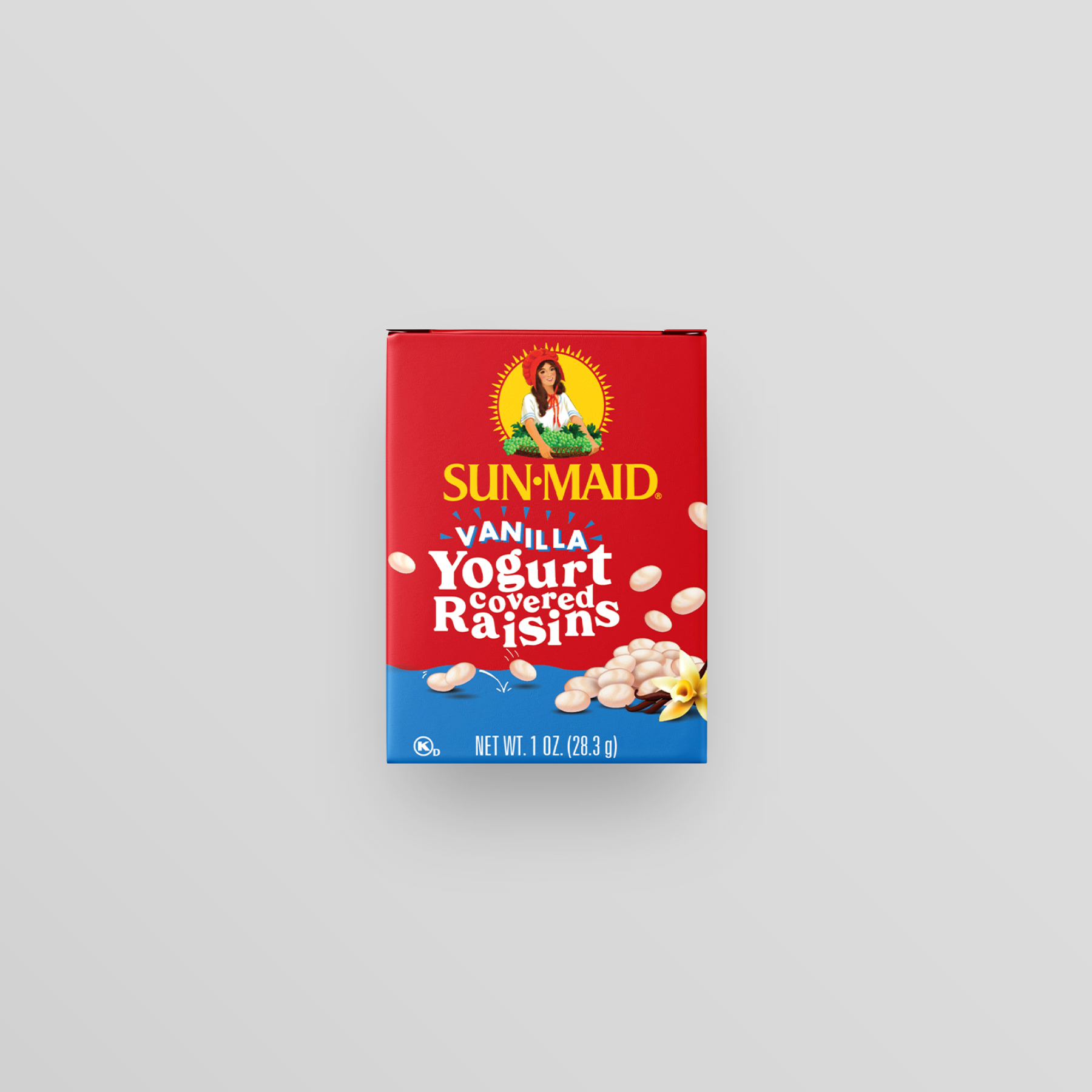
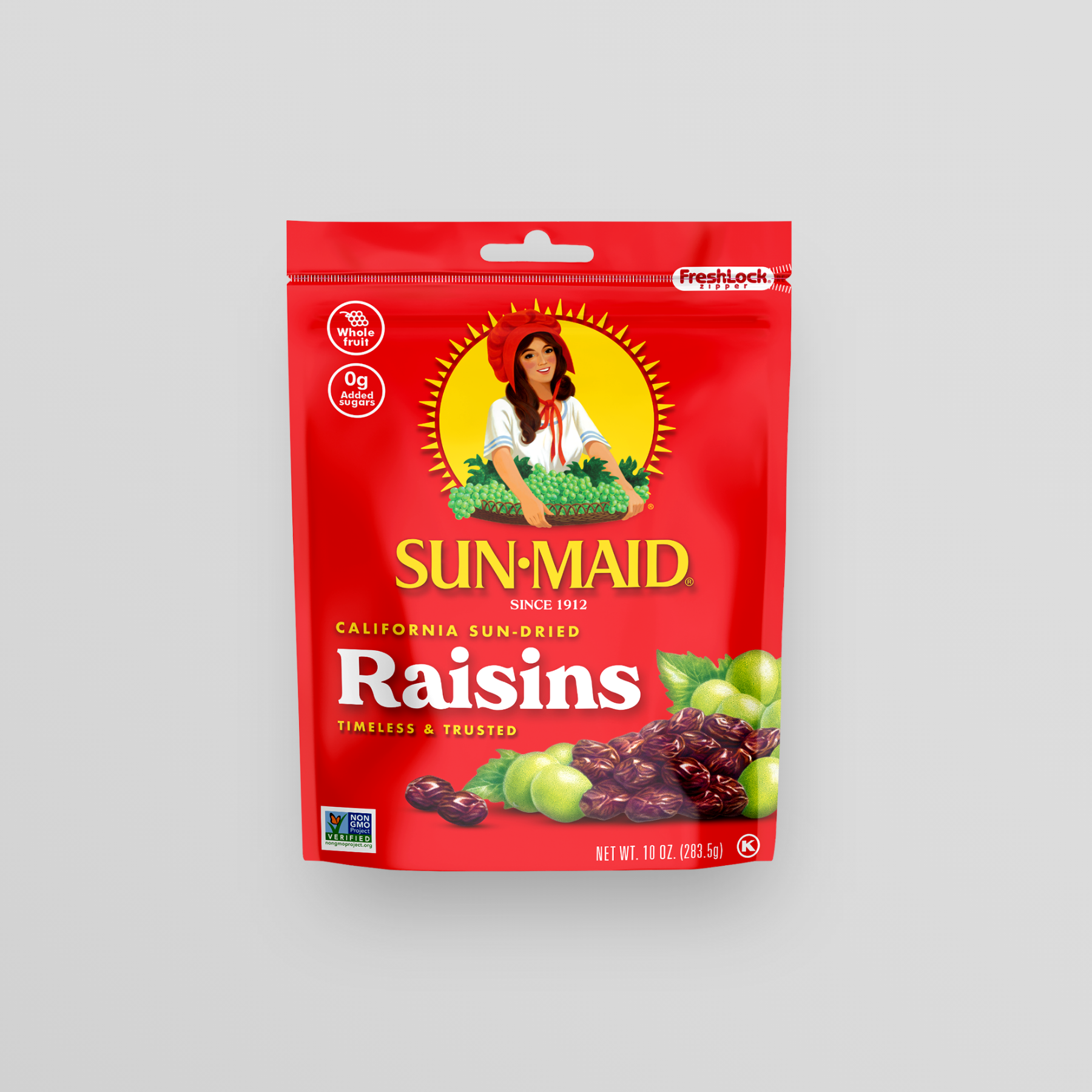
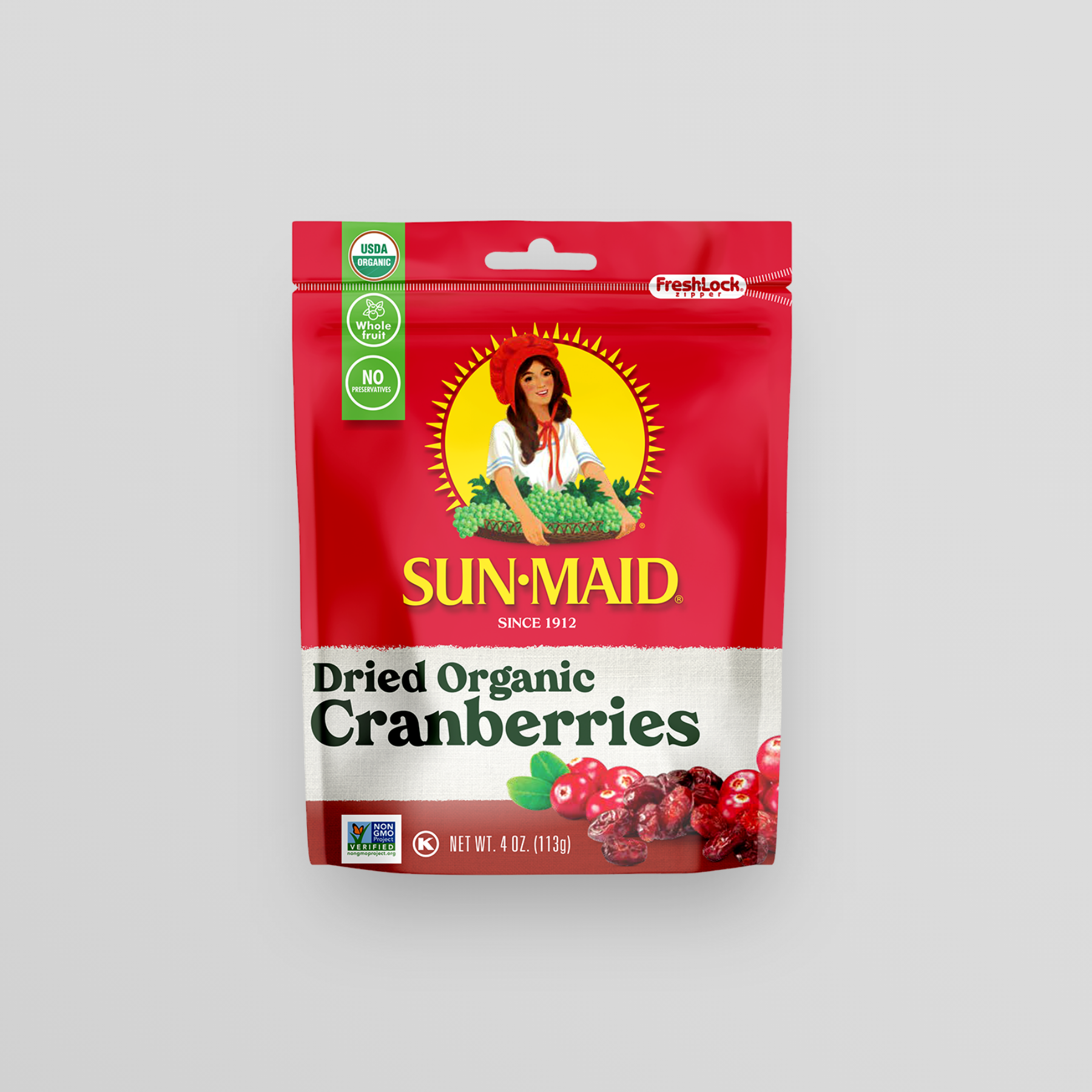
“A bold and humanist serif typeface set large really gives the packaging a retro and approachable feel, and by relying on the brand's classic red color and product illustrations, we created a consistent package design across the entire family of products.”
— Keith Seaman, Creative Director
Ultimately, we simplified and cleaned things up without harming the brand's heritage that is so deeply loved.
/ 02
PACKAGING REFRESH


/ 03
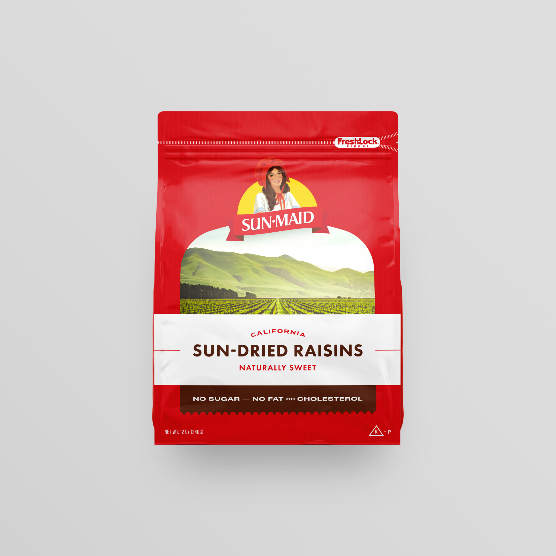
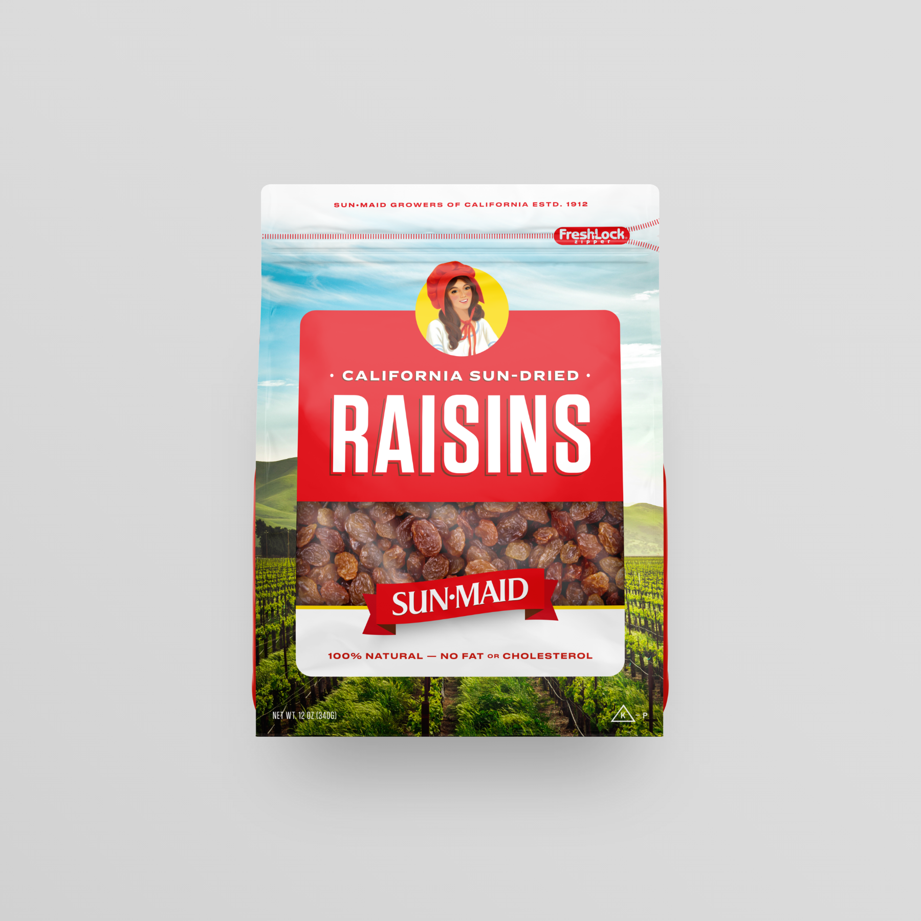
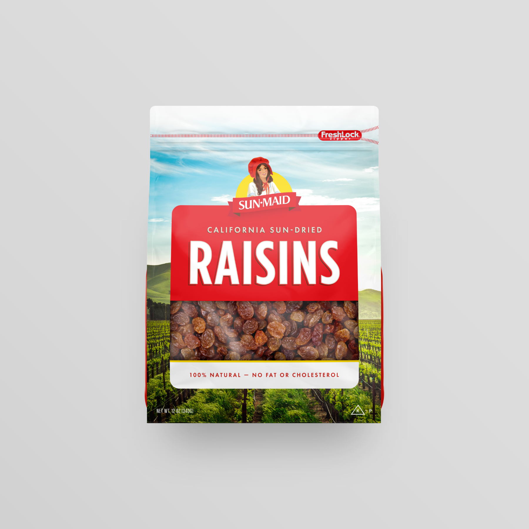
EXPLORATION

Hundreds of different packaging designs were developed to gather a large amount of feedback in focus groups that led to the final packaging design solutions. We focused in three major areas of exploration: Rustic, Natural/Naked and Color rush/Oversized.